Heatmaps & Footprints: Visual Market Tools
Heatmaps and footprint charts make different kinds of market data easier to inspect. A heatmap encodes a chosen variable with color; a footprint shows traded volume at prices within a bar. Neither name tells you whether the underlying data represent resting orders, executed trades or an estimate. Establish that distinction before interpreting a bright band as liquidity or a colored cell as a trade signal.
Start with native LuxAlgo order-flow tools to examine supported traded-volume data. Native footprints use pre-aggregated one-minute volume-at-price slices; they are not a live order book or trade tape. For strategy research, Quant, our coding agent, can help implement explicit rules using supported data. Inspect the generated code and run it manually.
Heatmaps, footprints and liquidation estimates compared
| Display | What it represents | What it does not establish |
|---|---|---|
| Order-book heatmap | Displayed resting bid and ask quantities over price and time, when the provider supplies depth data. | Guaranteed liquidity when your order arrives, hidden orders or executed volume. |
| Executed-volume heatmap | A color-coded summary of transactions within defined price/time groups. | Orders still waiting in the book or the identity of the participants. |
| Footprint chart | Executed volume at price inside each bar, often split by aggressor side. | The full order book, trader intentions or a guaranteed next move. |
| Estimated liquidation display | A model of liquidation activity or potential liquidation prices, depending on the tool. | A complete verified inventory of leveraged positions or exact forced-exit totals. |
A stock-market performance heatmap is another category: its colors can represent price change across companies or sectors. It should not be read like an order-book heatmap. Always identify the variable, units, data source, aggregation and color scale rather than relying on the word “heatmap.”
Read a heatmap through its legend
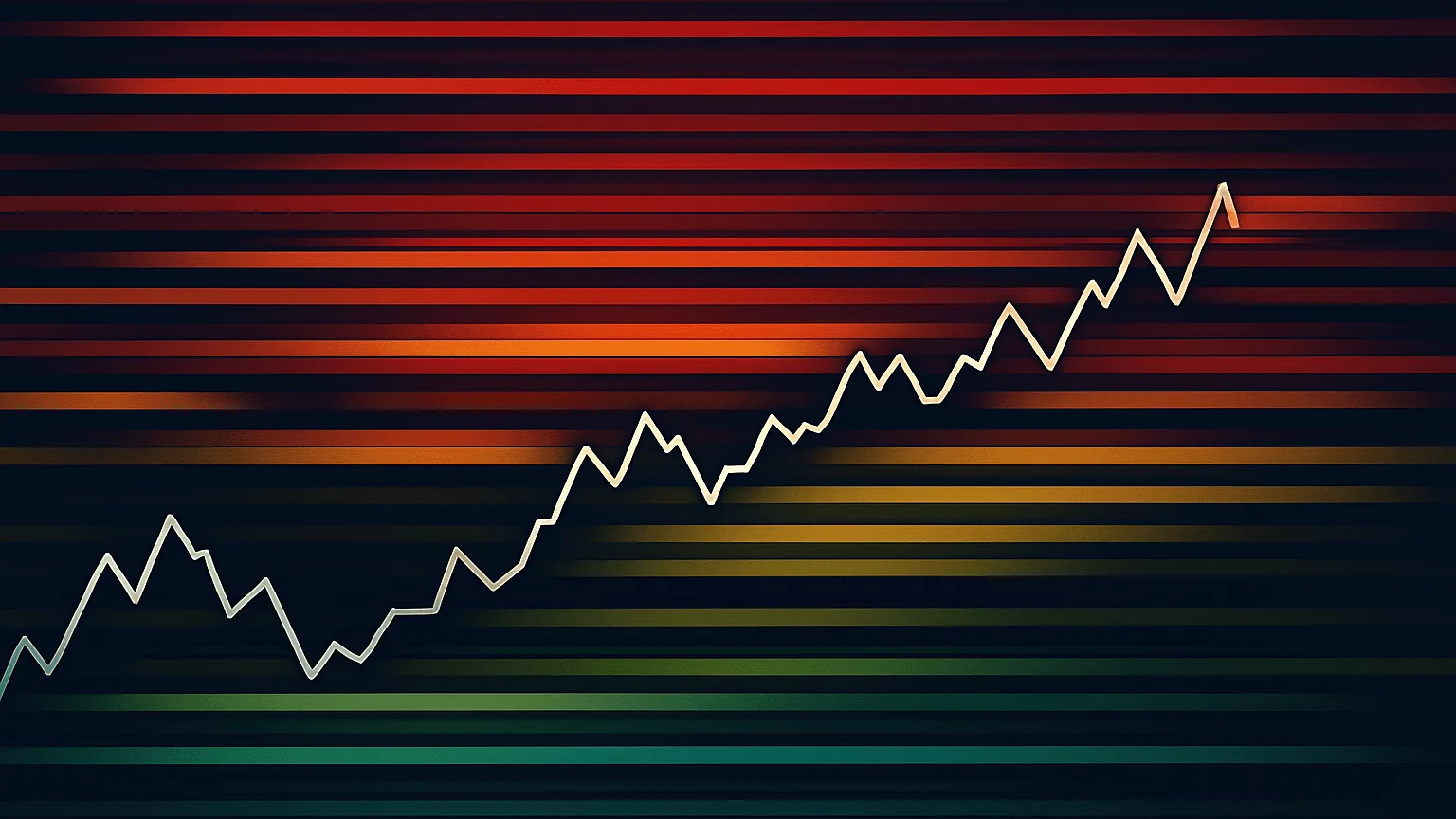
In an order-book heatmap, a persistent bright band can indicate a larger displayed quantity at a price. Orders can be added, reduced, canceled or executed as price approaches. The band alone cannot tell you which of those events will occur next, and visible depth does not include every possible source of liquidity.
In a traded-volume heatmap, a bright area instead describes activity that already occurred. Heavy past volume may be useful context, but it is not a promise that the same quantity remains available for your next order. A change in intensity can also come from normalization or display settings rather than an abrupt change in market behavior.
- Check the scale: determine whether colors show absolute size, a relative rank, net volume or another variable. Auto-scaling can make two screenshots look comparable when their underlying values differ.
- Check the venue and session: an exchange-specific view is only that venue’s activity. Regular-hours and extended-hours samples can differ substantially.
- Check the time window: distinguish a historical band from the latest available snapshot. A delayed feed cannot support a claim about current executable depth.
- Check the interpretation: red is not universally a long entry and blue is not universally a short entry. Colors describe the configured metric; entries need separate rules.
Scalpers may use finer observations when the feed and execution process support them. Day traders can compare activity around predefined levels, while swing traders may use broader volume context. A shorter timeframe does not automatically produce a better signal, and the cost of acting on a small apparent imbalance can be material.
How a footprint chart works
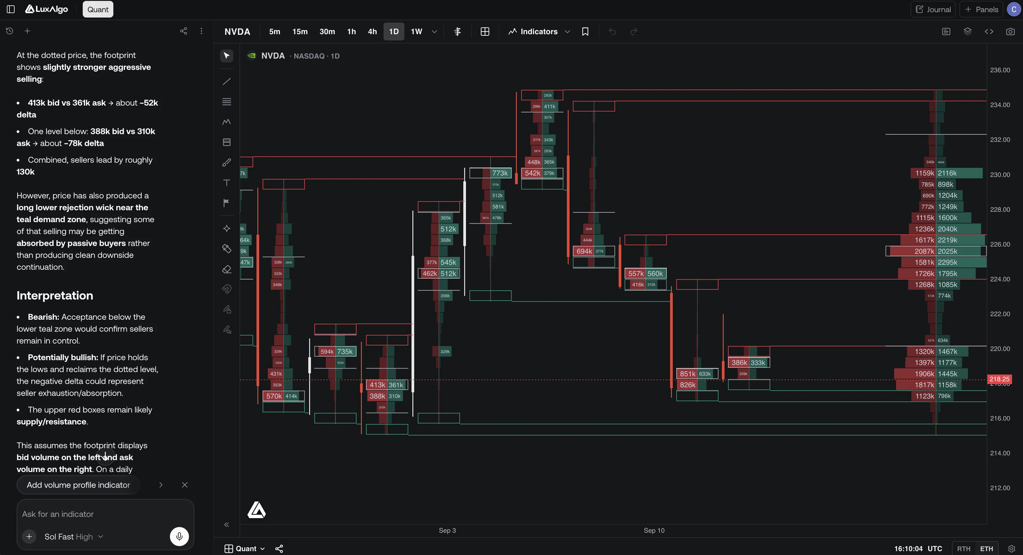
A footprint divides each bar into price rows and assigns executed volume to them. In an aggressor-side display, buy-side volume generally describes trades initiated against the offer and sell-side volume trades initiated against the bid. Every completed transaction still has a buyer and a seller: positive delta does not mean more buyers exist than sellers.
| Component | How to read it | Important limit |
|---|---|---|
| Bid × ask rows | Inspect sell-side and buy-side executed volume at the configured price row. | Row grouping and side classification affect what you see. |
| Delta | Buy-side volume minus sell-side volume for the row or bar being measured. | Aggressive buying can coexist with a falling price; delta is not a forecast. |
| Point of control | The highest-volume row within the selected bar or profile. | A descriptive volume maximum is not guaranteed support or resistance. |
| Value area | A band containing a configured share of profile volume. | A 70% setting is not a 70% chance of a future price outcome. |
| Imbalance | A comparison between specified buy and sell quantities, often diagonal. | Thresholds, minimum size and price-row aggregation determine the flag. |
| Unfinished auction | Both sides printed at an outermost row under the tool’s criteria. | The label does not guarantee that price will revisit that level. |
Distinguish row delta from a diagonal imbalance
In a hypothetical row, buy volume of 400 and sell volume of 250 give delta = 150 and total volume of 650. Delta as a share of total volume is approximately 23.08%. That arithmetic compares the two sides of the same row.
A diagonal buying-imbalance test can compare those 400 buy units with 100 sell units at the adjacent lower price instead: 400 ÷ 100 = 4. That is a 4× comparison, not the row’s delta percentage. Check the platform’s exact comparison, treatment of zero values and configured threshold before interpreting a highlight.
LuxAlgo’s documented footprint default is a 300% diagonal ratio, meaning one side is at least three times the comparison side. Stacked imbalances group consecutive same-side rows, with a configurable minimum. A highlighted run records measured aggression; its future usefulness as a level must be tested.
Interpret absorption as a hypothesis
Large aggressive volume with little price progress can be consistent with opposing passive orders absorbing that activity. It does not identify an institution, reveal a trader’s total position or prove a reversal is coming. Similar-looking bars can arise in different contexts. Define what subsequent price behavior would support or reject the interpretation.
Likewise, a high-volume area does not prove accumulation, distribution or that traders are trapped. Those are interpretations requiring further evidence. Use descriptive language—such as “high executed volume with limited upward progress”—before assigning a narrative to the participants.
Set up footprints in native LuxAlgo
The Footprint chart type supports several independently configured profiles around each candle. A Footprint overlay keeps the ordinary candles and adds one per-bar profile; Visible Range Footprint aggregates the bars currently on screen. Those are different scopes, so label which one you are reading.
- Choose a footprint-capable symbol. Current data documentation lists crypto and US equities for footprint-dependent tools; forex, commodities and CME futures are candle-only sources in this workflow. US-equity data represent Cboe EDGX, not consolidated US-market volume.
- Select a session and timeframe before comparing results. RTH and ETH choices change the observations included where a trading calendar applies.
- Choose a display mode: a two-sided profile or bid/ask ladder, a volume profile, a delta profile or absolute delta. Keep the legend visible while learning the differences.
- Use a consistent row size for comparisons. Automatic row merging changes with zoom, and imbalance and auction flags are recomputed for the displayed groups. Manual ticks per row can make the grouping explicit.
- Inspect the stat table and row readout. Missing trade-count data appear as a dash; do not treat unavailable counts as zero.
- Use the hover magnifier or zoom to inspect dense cells. A readable overview and a precise row-level inspection serve different purposes.
The visible-range profile changes when the visible range changes. It is not necessarily the same as a fixed session profile, and it should not silently include future bars in a historical decision. Native TPO, VWAP and Visible Range Volume Profile can use candle data on markets without footprints; their availability does not imply that bid/ask footprint data are available there.
History also has separate limits for candles and footprints. Check the current plan and data documentation for the instrument and period you need. Do not infer that loading a long candle history provides the same length of detailed order-flow history.
Where LuxAlgo liquidation tools fit
Crypto Liquidation Heatmap: estimated activity across assets
The Crypto Liquidation Heatmap ranks estimated liquidation activity across a configured cryptocurrency list. Its documentation explains that complete liquidation feeds are not readily available, so estimates use the relationship between volume and price movement. Read the values as modeled proportions and trends, not exact totals from every exchange.
In this particular tool, green indicates estimated long liquidations exceeding shorts, while red indicates estimated short liquidations dominating. That convention does not translate into a universal buy/sell instruction. Keep selected instruments on the same exchange and in the same quote currency to avoid mixing unlike volume measures.
Liquidation Levels: modeled price zones
The Liquidation Levels indicator starts from qualifying activity and a reference price to project potential liquidation zones for configured leverage tiers. Bubbles and lines visualize the model. They do not establish that a known quantity of real positions opened at those prices or that an exchange will liquidate them at the displayed line.
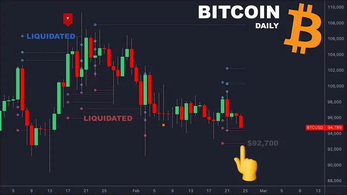
- Reference Price: determines the base used for the projected levels.
- Volume Threshold and Volatility Threshold: control which activity qualifies for displaying the model.
- Leverage Options: select the assumed leverage tiers and their colors; the documented examples include 100×, 50× and 25×.
- Visibility controls: show or hide bubbles and level lines independently.
Actual liquidation rules depend on the venue, contract, margin setup and position details. A simple chart model is not an account-level liquidation calculator. Use a projected zone as a question to investigate, not proof that price must be attracted to it or reverse there.
Combine the tools in a repeatable trading process
Begin with a market context and level chosen before the outcome is known. Then decide which data can answer the next question: displayed depth, executed volume or a model of liquidation activity. Combining different views is useful only when their meanings remain distinct.
- Define context: record the venue, session, timeframe, relevant event calendar and planned area of interest.
- Observe the approach: distinguish changes in resting quantities from transactions that actually occurred. On native LuxAlgo, use supported executed-volume tools rather than assuming a live book is present.
- Specify a trigger: state the required price behavior and any footprint threshold. “The colors look strong” is not a reproducible rule.
- Specify failure: define the price, time or other measurable condition that ends the trade thesis, plus how an order would be executed.
- Review the result: compare the planned interpretation with actual fills and subsequent price behavior, including examples that failed.
Moving averages, RSI or a Library overlay may supply additional context, but several indicators can repeat similar price information. Their agreement does not automatically reduce false signals, and chart analysis itself does not place broker orders.
Make the risk arithmetic explicit
Consider a hypothetical stock entry at $80 with a planned stop at $78.50. A $170 total budget reserving $20 for estimated costs leaves $150 for price risk. At $1.50 per share, that allows 100 shares, or $8,000 of position value. An exit at $83 would produce $300 gross profit; a gap and fill at $77 would lose $300 before costs. A stop price is not a guaranteed fill or loss cap.
Check whether the position fits the available capital, trade increments and total portfolio exposure. Multiple positions reacting to the same event can lose together. Neither an imbalance nor a bright heatmap band justifies ignoring spreads, gaps or execution uncertainty.
Test what the available data can support
With Quant, our coding agent, describe the desired rules, data requirements, signal timing, position size and exits. Inspect the generated code and run the strategy manually using the native strategy workflow. Review inputs and properties, including applicable costs and order assumptions.
A candle-only backtest cannot reconstruct a historical order book or the precise sequence of every trade inside a candle. Do not claim to have tested a depth-based or footprint-based rule unless the implementation actually has the required historical inputs. When those inputs are unavailable, test a clearly labeled simpler rule or collect an appropriate sample; do not present a proxy as the original strategy.
Freeze settings before evaluating unseen periods. Record failed signals, trading costs and the number of independent trades. Screenshots selected after a move illustrate a concept but do not establish strategy performance. For discretionary study, save the view and settings available at the decision time, then review the subsequent outcome separately.
Video: interpreting a market heatmap
The following recorded lesson discusses heatmap interpretation using an external order-book interface. It is useful context for distinguishing displayed inventory from executed activity; it is not a demonstration of a live order book inside native LuxAlgo. Read its examples alongside the data and risk distinctions above.
Frequently asked questions
Is a heatmap the same as a footprint chart?
No. A heatmap colors a chosen variable, which might be resting orders, executed volume or estimated liquidation activity. A footprint displays executed volume at prices within bars. Read the data definition before comparing them.
Does positive delta mean price must rise?
No. Positive delta describes more buy-side than sell-side aggressor volume in the measured sample. Every trade still has a buyer and a seller, and price can fall despite positive delta.
Does native LuxAlgo provide a live order book?
The documented native order-flow workflow uses pre-aggregated one-minute footprints and candles, not a live order book or trade tape. Footprint-dependent tools currently support crypto and US equities.
Are liquidation heatmap values exact?
Not for the described Crypto Liquidation Heatmap. It estimates activity from volume and price movement. Liquidation Levels separately models potential price zones using configurable assumptions.
Do stacked imbalances or unfinished auctions guarantee a revisit?
No. They describe conditions under the selected settings. Subsequent price behavior is uncertain, and row aggregation can change which conditions are highlighted.
Can I backtest an order-flow idea with Quant?
Specify the required data and rules, inspect the generated implementation and run it manually. A valid test needs the actual historical inputs; a candle-only proxy does not establish the performance of a depth-based or footprint-based rule.
References
- LuxAlgo — Native Order Flow; pre-aggregated data, tool families and the absence of a live order book or trade tape.
- LuxAlgo — Footprint; display modes, row aggregation, diagonal imbalances, unfinished auctions, profiles and the native screenshot.
- LuxAlgo — Chart Data; venue scope, supported markets, sessions and separate history limits.
- LuxAlgo — Crypto Liquidation Heatmap; estimated activity, color interpretation and exchange/quote-currency constraints.
- LuxAlgo — Liquidation Levels; reference price, activity filters, leverage assumptions and visual controls.
- LuxAlgo — Making Strategies and Native Strategy Settings; code review, manual runs and testing properties.
- Market heatmap tutorial — video; recorded external-interface demonstration.
Numerical trade and imbalance examples are hypothetical calculations. Historical illustrations and indicator documentation explain how to read the displays; they do not prove a profitable trading strategy.
Read next